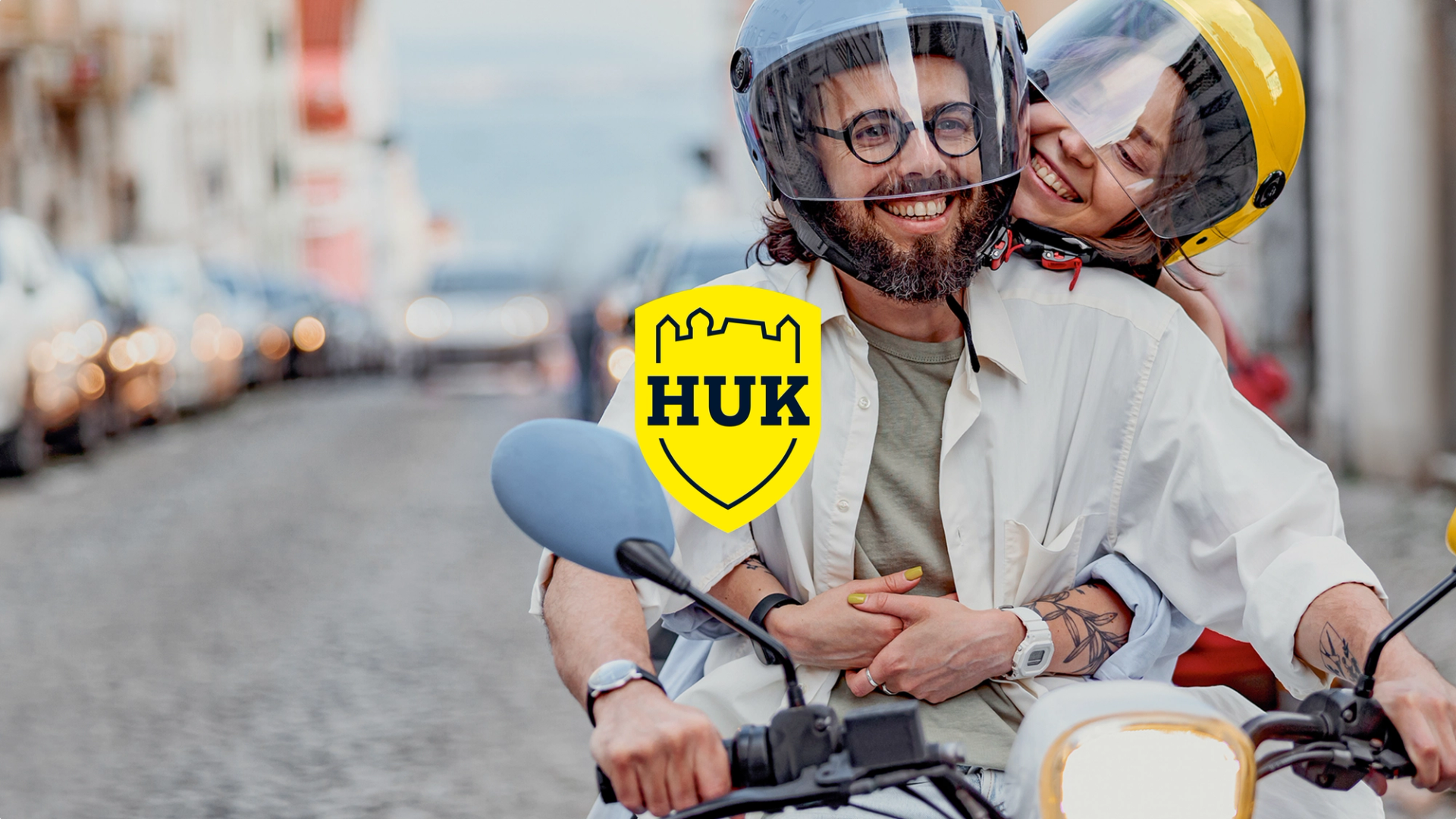
HUK-COBURG

On the move and still true to huk

A smiling couple wearing helmets on a scooter on a city street; in the foreground, the yellow HUK-COBURG logo as an overlay.

About HUK-COBURG

With over 13 million customers, the HUK‑COBURG insurance group is one of Germany’s largest private insurers and the undisputed leader in car insurance. The iconic yellow brand has always stood for reliability and customer focus.

Uncomfortable Truth

Changing customer needs demand new kinds of brands

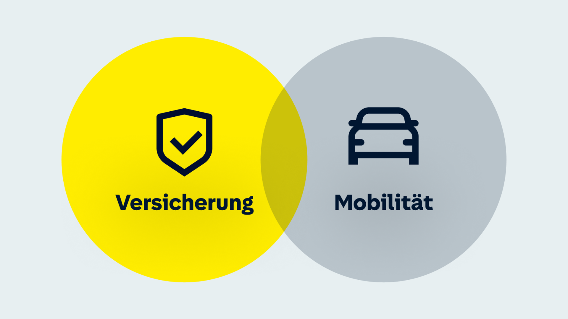
HUK is transforming from a pure insurance provider into a full-service mobility company and suddenly finds itself competing with businesses beyond the insurance sector – such as car dealerships, mobility services, or digital platforms. The challenge was to bridge both worlds with the new brand identity, brand design and brand experience.

A diagram showing the overlap between insurance and mobility
Purpose: We keep moving forward. So our customers can keep moving forwardHUK divides brand tones into two categories: “differentiating” tones (collaborative, dynamic, optimistic, confident) and “fundamental” tones (reassuring, simple, reliable, solid).
Our Approach

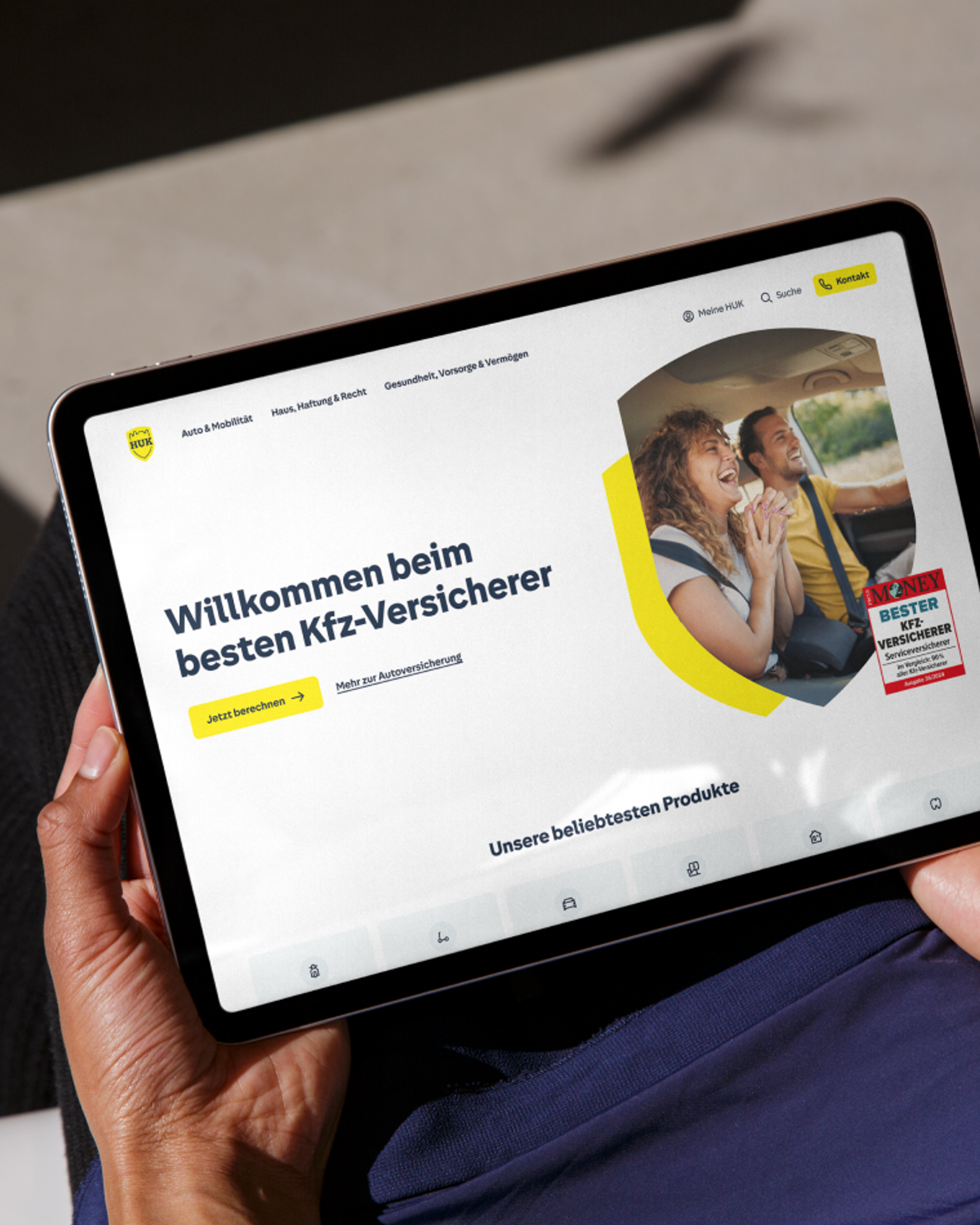
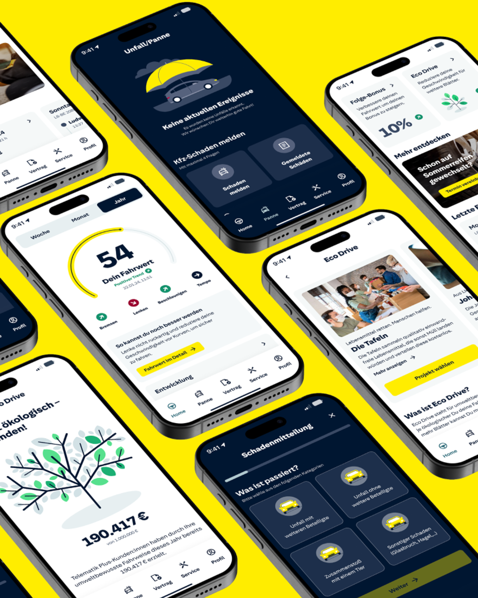
Improving the customer experience with a focus on digital

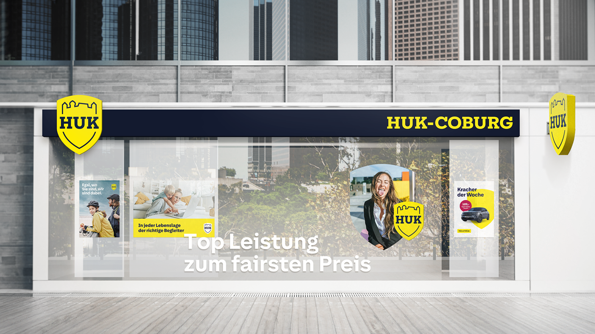
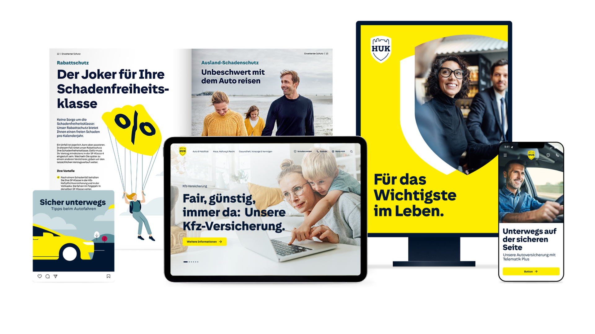
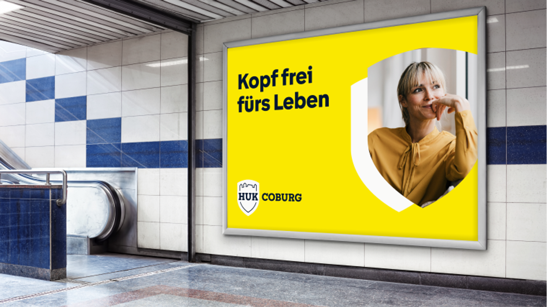
People prefer brands and products that make their lives easier. Easy-to-use products feel more premium, more attractive, and foster customer loyalty. To remain competitive, the brand strategy was adjusted, and the brand identity was greatly simplified and modernized, with a focus on digital applications. The goal is to improve and simplify the customer experience – digitally, on-site, and across traditional advertising channels. The changing expectations are at the center, while still maintaining a brand appearance that is typically HUK.

An overview of various advertising and interface formats that demonstrates the design's modular adaptability.
Various digital advertising materials on desktop monitors, laptops, and tablets featuring the new HUK branding
Das klassische, detailreiche Wappen-Logo (beschriftet mit „bis 2024“) blendet weich in das neue, reduzierte und flächige Design in hellem Gelb (beschriftet mit „ab 2024“) über. Der Prozess verdeutlicht die Modernisierung der Marke bei gleichzeitiger Beibehaltung der ikonischen Schildform.
A large subway advertisement features a portrait of a smiling woman in a shield-shaped cutout and the slogan “Clear your mind for life”
Keychain with HUK crest logo
Illustration of the design’s graphical scalability using a car as an example, shown at four levels of detail: from an abstract, functional icon, through a colorful narrative icon and a mini-illustration, to a complex illustrated world.
Close-up of the letters “g” and “i” from the HUK Sans house typeface. Blue circles highlight specific curves and design features of the typography
The word “Hello” animated in different font styles
HUK SANS

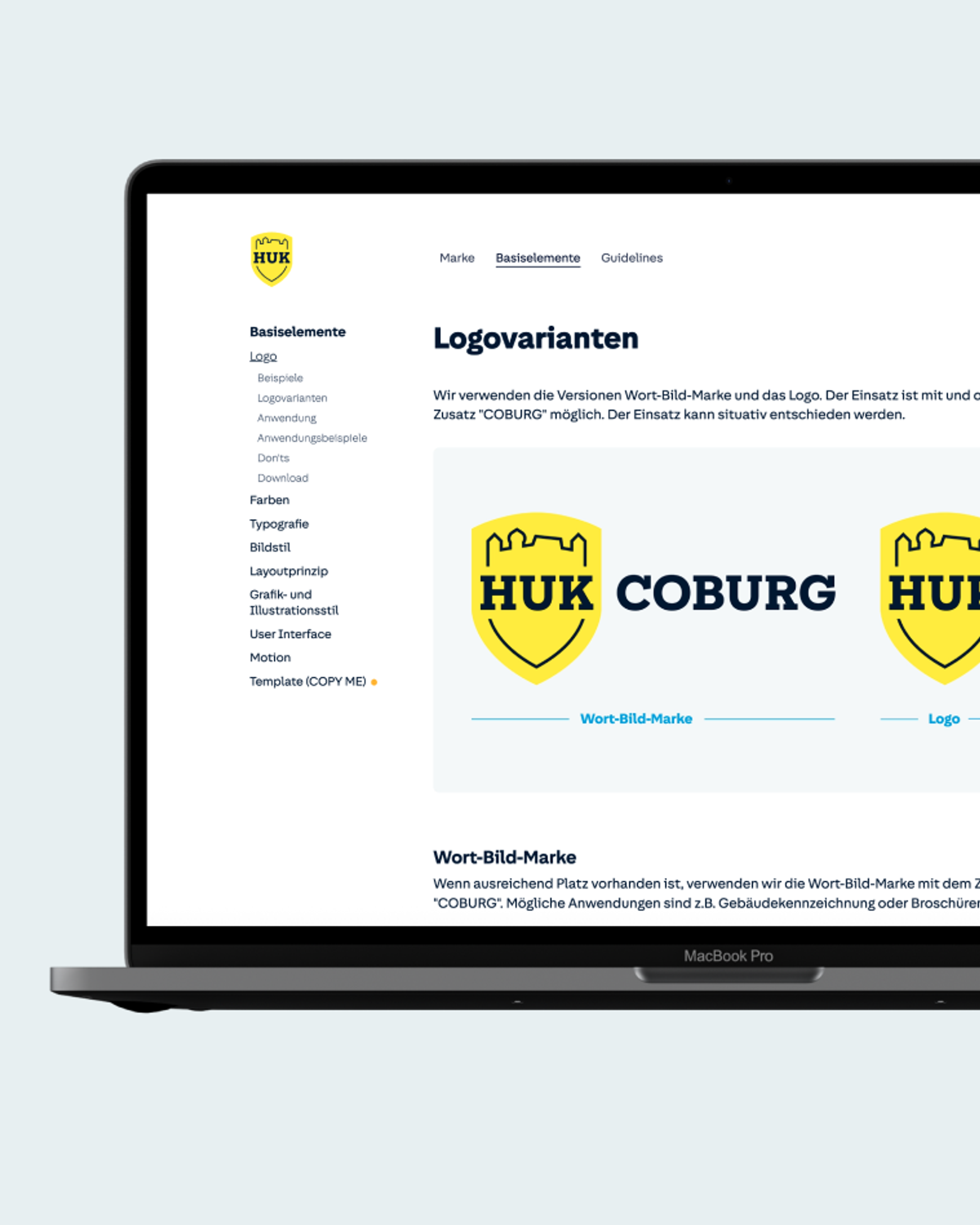
Our goals were to improve typographic quality, simplify the font’s use, enhance its recognizability and readability, and at the same time significantly reduce ongoing licensing costs. We achieved these goals by developing a custom font in collaboration with Character Type.

UI components of the HUK design: The interface features interactive tiles for car and motorcycle insurance, a mileage display, a date range selector, form fields with error messages, and a news article featuring a driver.
The Impact

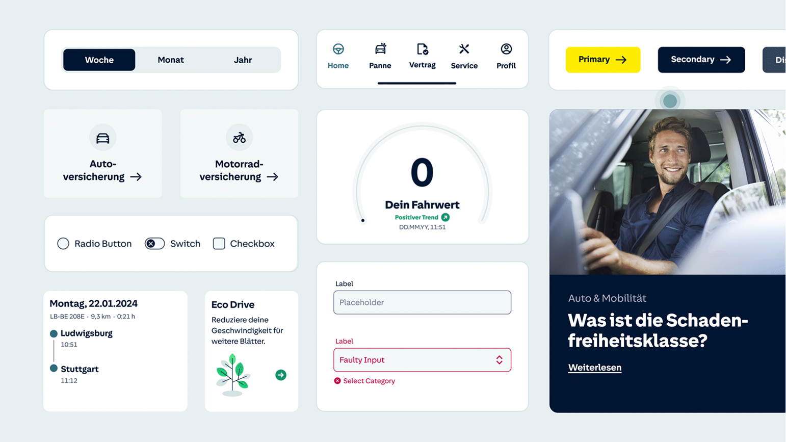
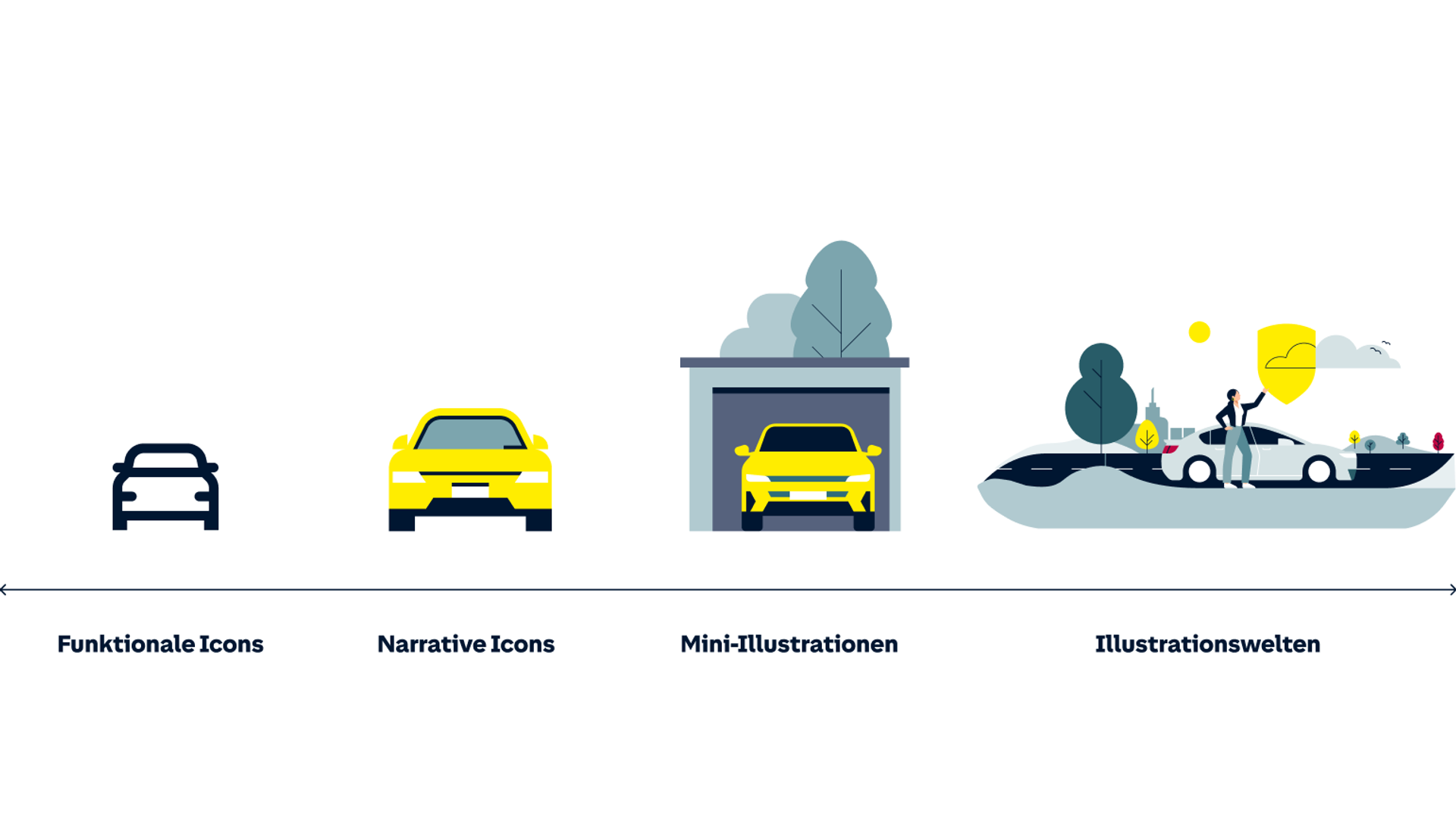
A design system that builds the bridge between the brand and its customers

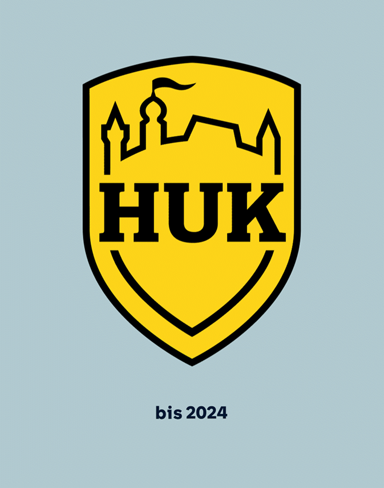
Thanks to its strong brand, HUK is one of the few insurers that can forgo a presence on comparison portals. The brand is therefore crucial to the company’s success. In collaboration with HUK’s brand team, we developed a forward-looking, modular design that strengthens brand perception and enables seamless experiences across all channels. The new brand appearance combines HUK’s long-standing tradition with modern design, positioning the brand optimally for the demands of the future.

“The requirements for our brand design have changed significantly in recent years. With the new identity, we emphasize our increasingly digital focus.”

Jörg Quehl
Head of Marketing, HUK-COBURG
Tablet showing new website of HUK
Photorealistic mockup of a HUK branch office featuring large window decals in the new yellow-and-white brand design
Side-by-side smartphone mockups showing the mobile app interface with dark mode and yellow accents.A laptop displaying the Brandportal dashboard

More case studies