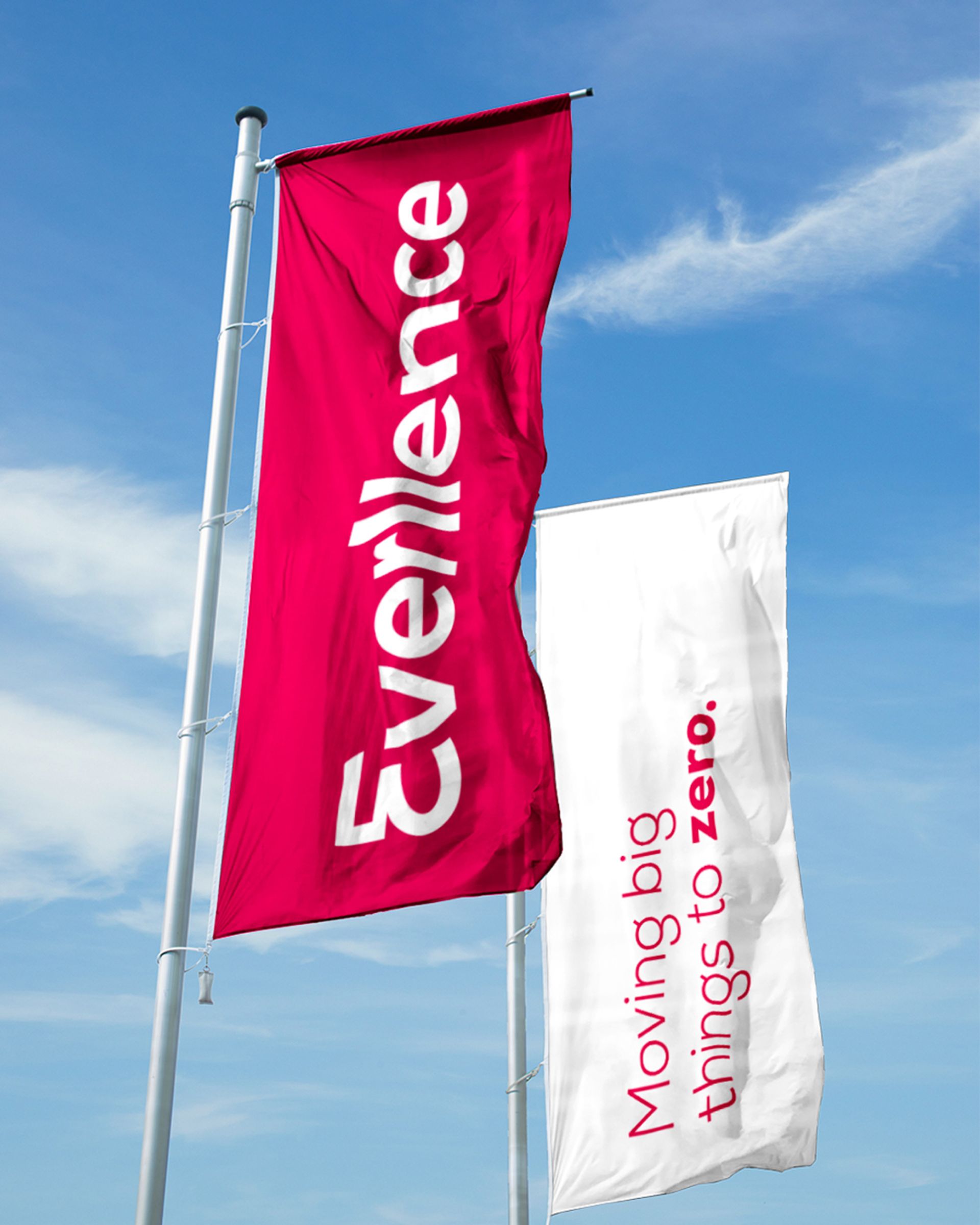
Everllence
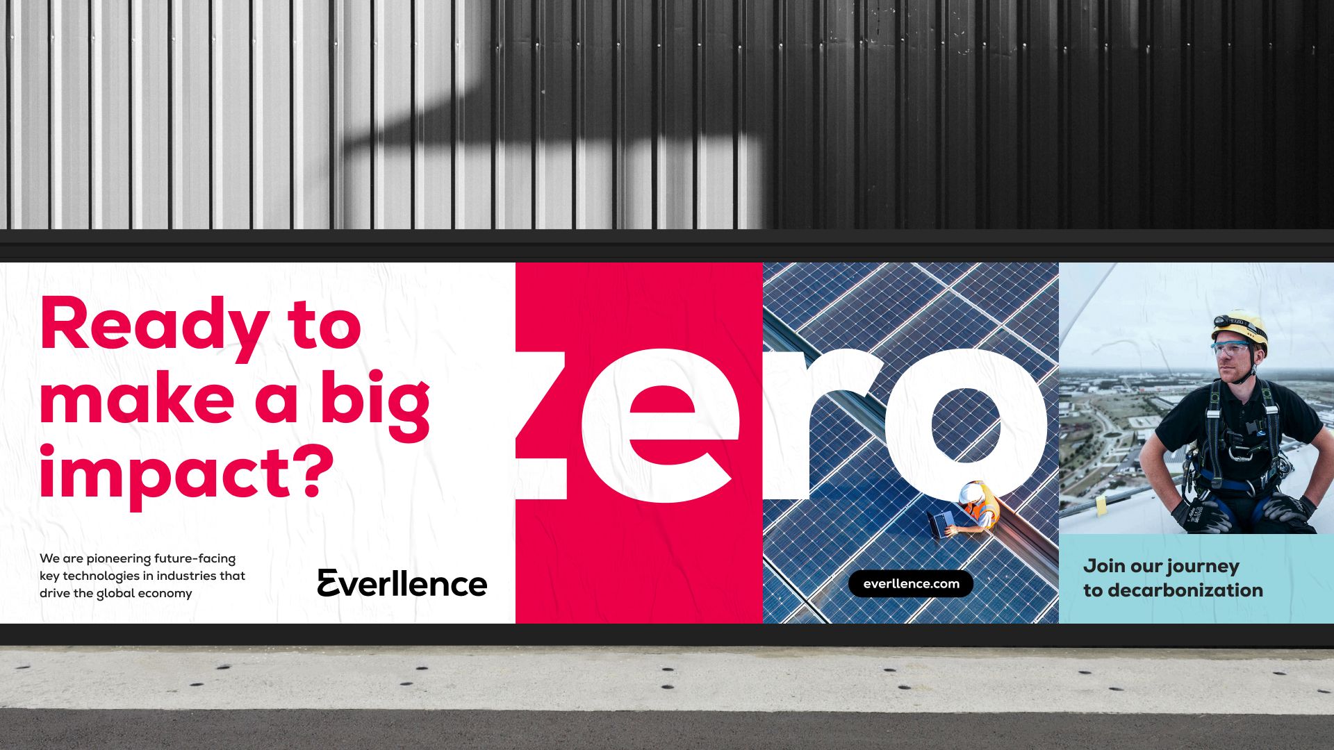
Moving Big Things to Zero
A new market demands something new
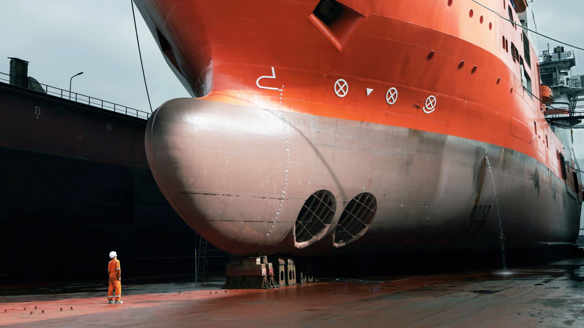
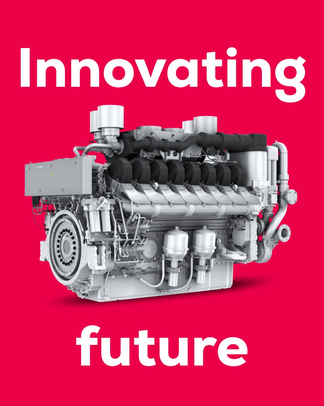
The entire engine industry is undergoing a radical transformation. MAN Energy Solutions has had to navigate this challenging new market environment while mastering the shift toward climate‑neutral technologies and sustainable propulsion systems. The uncomfortable truth: the old MAN brand embodied the traditional, fossil‑based engine world. To credibly enter the new market for sustainable propulsion systems, a radical restart was necessary. The consequence: We had to create a new identity, a new name, and a new brand.
A New Identity Driving Change
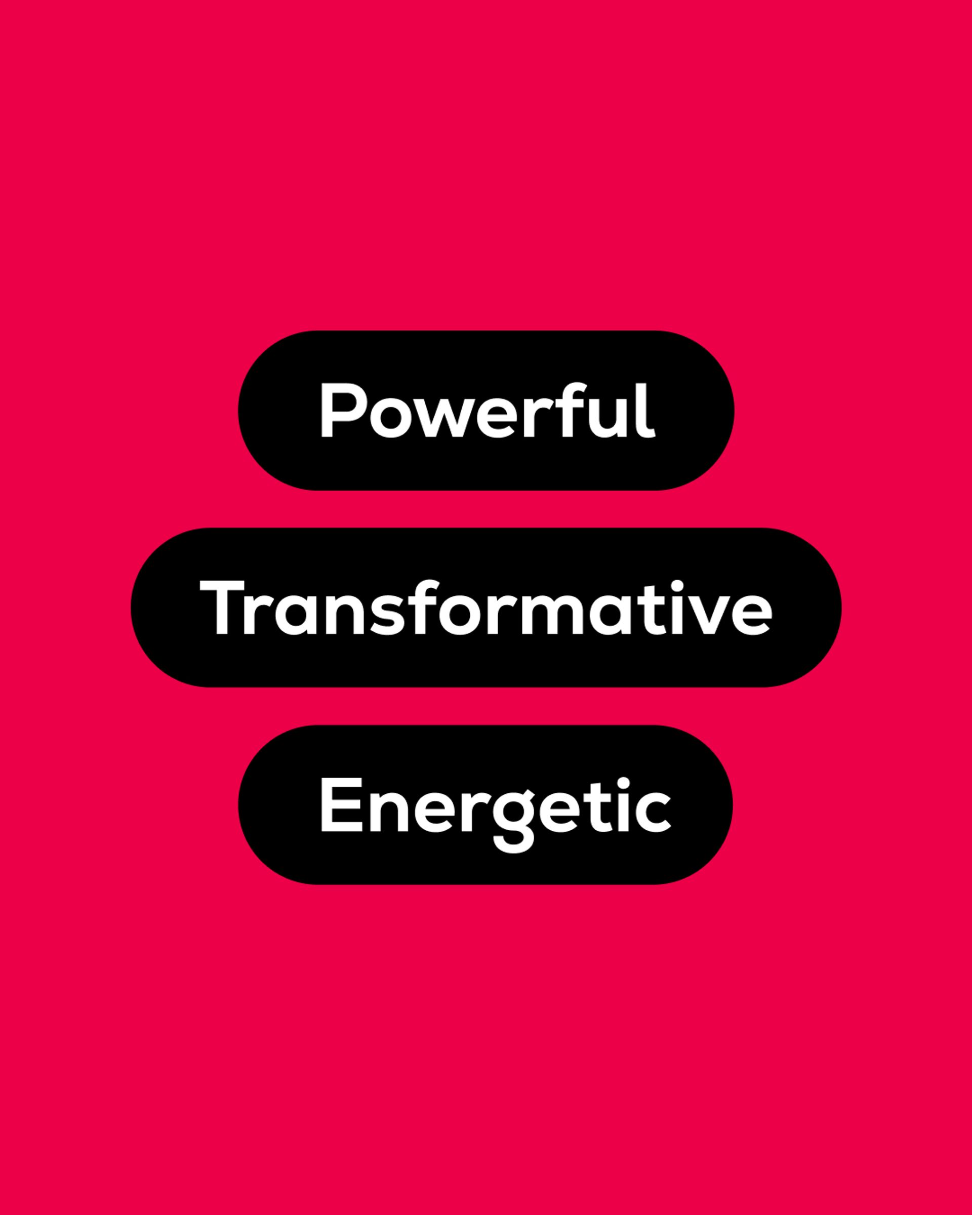
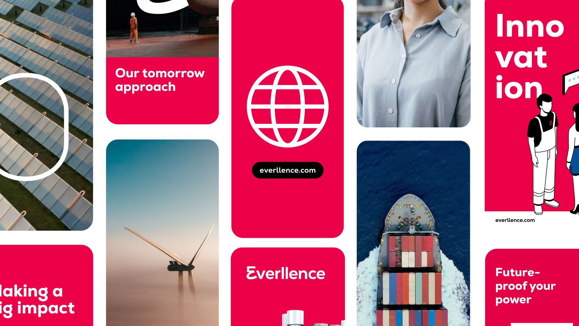
Based on the guiding principle “Moving big things to zero,” we developed a brand identity that positions Everllence as an independent, forward-looking brand – bold in its messaging, flexible in its execution. What defines our collaboration apart: Listening. Understanding. Developing. Implementing. Strategy becomes a mindset. Mindset becomes design.
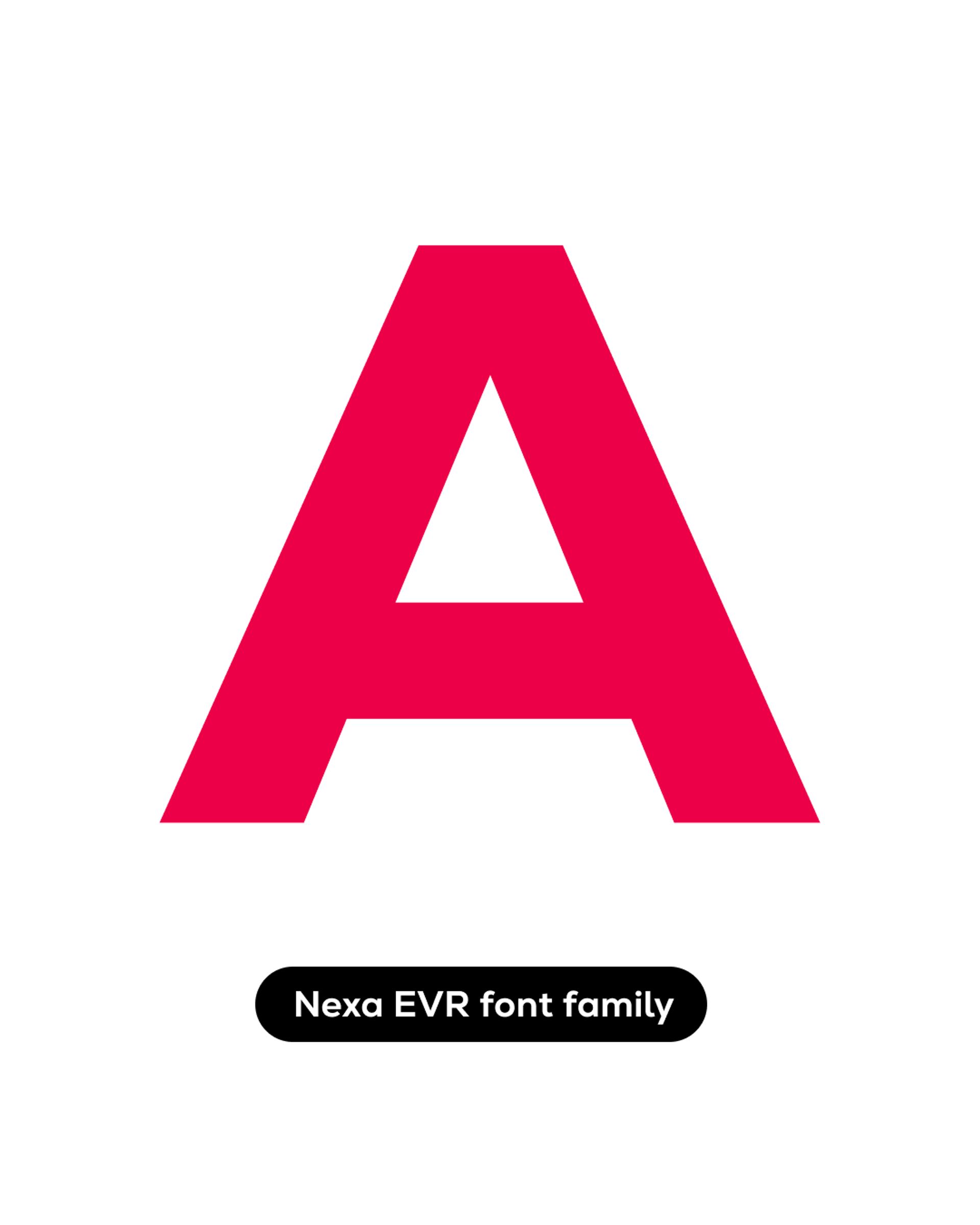
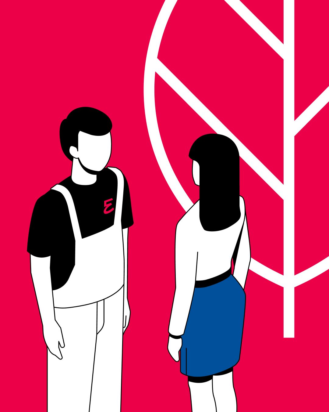
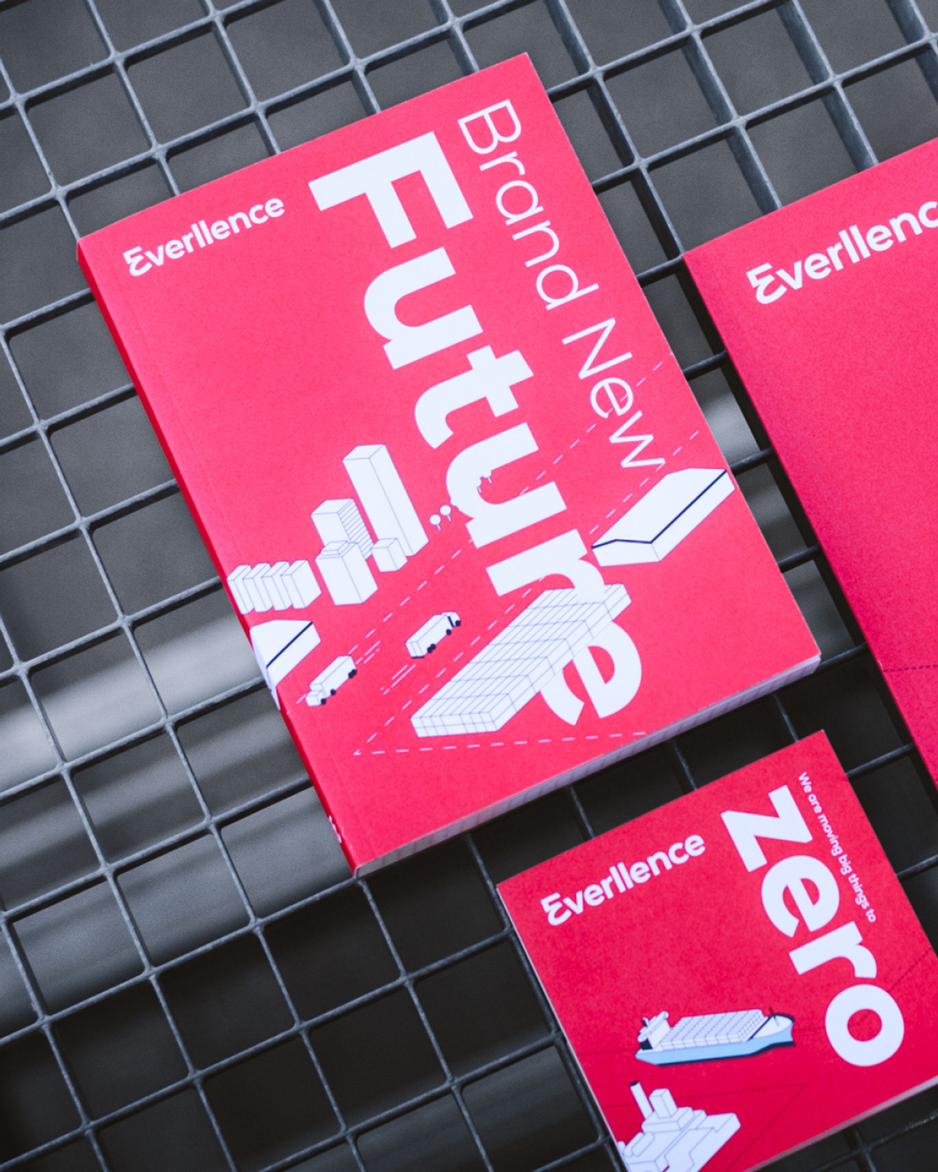
Focus on Character
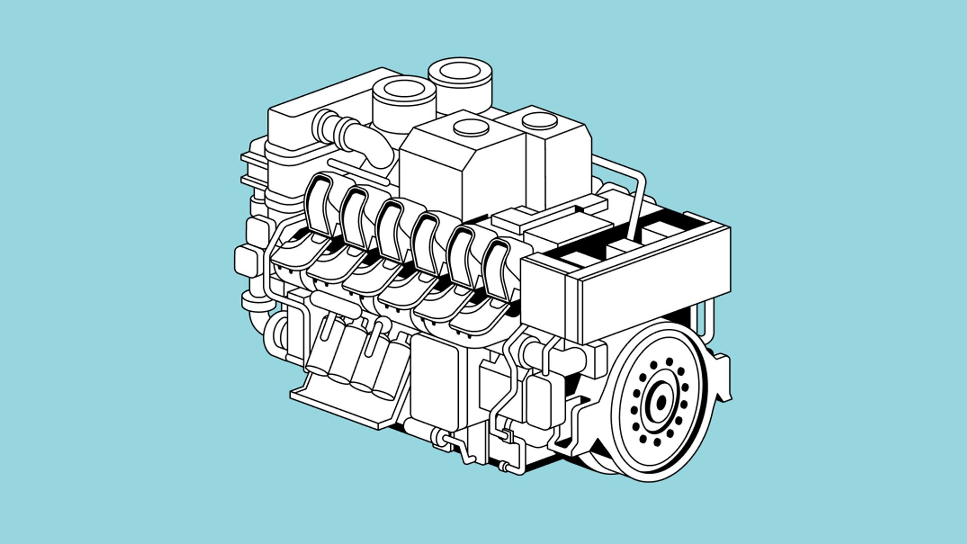
A distinctive illustration style enhances the overall design by adding depth, clarity, and meaningful visual value.
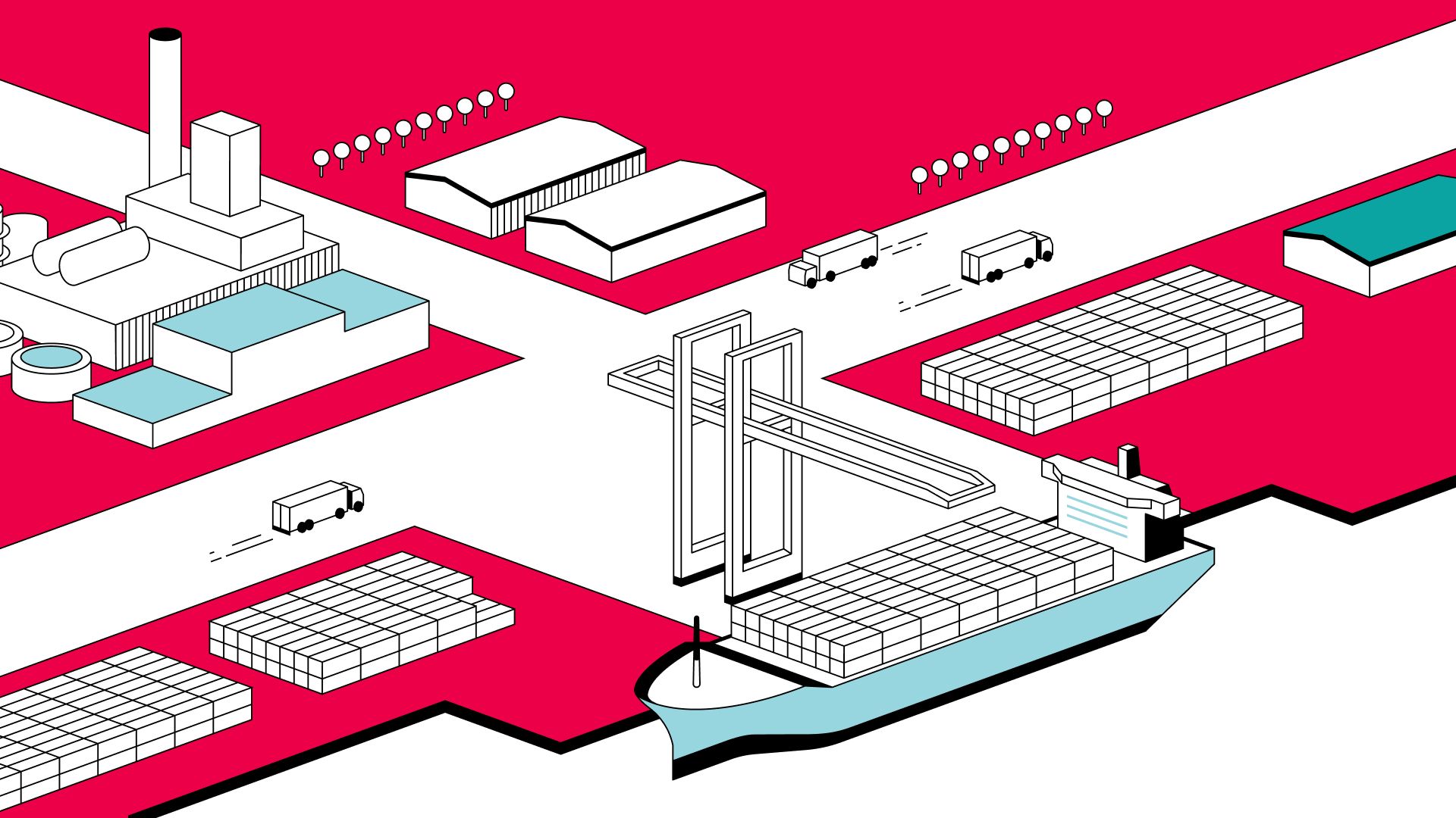
Seamless translation
The style seamlessly translates technical content from imagery and CGI into a unified visual language, adding a clear illustrative layer.
A brand with direction, backbone and relevance
A strong identity creates real engagement, both internally and externally, which is the most important foundation for long-term market success. This is exactly what we achieved with this identity-driven transformation. At its core is a strong narrative: We move big things to zero. The new brand represents this mindset, fueled by a determination to drive change through technology.

As a global company with a tradition, it was important for us to shape change credibly. Everllence's new brand image combines our technical expertise with a clear stance on decarbonization and innovation – and this resonates very well with our employees.
Martin Stich-Kluge
Senior Brand Manager, EVERLLENCE
The rebranding of MAN Energy Solutions to Everllence marks more than just a name change - it stands for a strong stance in an industry in transition.
Siona Steinacker
Senior Art Director, STRICHPUNKT